Showing posts with label Graphic Design. Show all posts

December 8, 2011

Nostalgia Photography Branding

nostalgia
Last month I had the amazing opportunity to work with Elli of Nostalgia Photography on her new logo and branding for her photography business. It was truly an honor. She is having a brand launch party Dec. 18th which you can check out here! SO excited for you Elli!nostalgia1

November 22, 2011

2 Cent Tuesday #4: Typography

My favorite thing in the world (well, in the design world) would have to be typography. I don’t know why I love it, it’s just one of those things. When type is beautiful and laid out just so – it makes my heart sing. Conversely, when fonts are just terrible and the layout was never taken into consideration I want to die. Dramatic? Maybe. But, it’s the honest truth. I also love it because I feel like it is a skill I can constantly improve on. If you're just starting out in the design world here are 5 quick typography tips to make your designs more wonderful!

image1
No. 1 LEARN THE BASICS (image source)
Before you can really appreciate great typography and layout you need to understand what makes great typography great. Become familiar with certain type styles: serif, sans serif, script, hand drawn, etc. If you would really like to read up on the subject visit I love Typography and read Paul Dean’s eXtreme Type Terminology column. It is loaded with great information about typography, the history behind type faces and type setting.

2No. 2 ESTABLISH A HIERARCHY AND A GRID (image source)
Hierarchy refers to where you want the reader to start reading and how they should proceed. Your header or title does not always need to be located at the upper left hand corner. With a well-defined hierarchy the reader’s eyes will be drawn to the most important information first. Using size and type faces to establish a hierarchy is important. It is also important to stick to a grid. When doing this don’t let the length of your paragraph line be so long that the paragraphs become difficult to read. On the other hand don’t let line length be so short that the eye can’t stay focused.

3No. 3 DON'T OVERWHELM YOUR DESIGN WITH TOO MANY FONTS (image source)
A good rule of thumb is to use around 3 to 4 fonts. Keeping your fonts consistent throughout your layout will help you establish your hierarchy and provide balance. Ever wonder what font is being used in a certain layout? Fonts In Use is a great site to look at to get some typography ideas AND it tells you what font is being used where.

4No. 4 AVOID USING DECORATIVE FONTS IN YOUR BODY COPY (image source)
Decorative type faces should be used as accents or headers in your design. Script type, hand drawn type, overly complicated type - should not be used in a paragraph! Ever. When laying out a web site or an editorial piece information is key. Allow your reader to actually read it.

5No. 5 PAIR FONTS TOGETHER WISELY (image source)
Thoughtfully pair serif, sans serif and scripted type faces together. Using different fonts to compliment each other is an art. It also gives your design more depth and interest. Avoid pairing two fonts that are very similar to each other, this will just look like a sloppy mistake.

Need an excellent source for downloading free fonts besides dafont.com? Try LostType.com, they have some very beautiful fonts that you can download for free.

November 15, 2011

2 Cent Tuesday #3: Beautify your Blog

advice
I’ve never really considered myself a blogger. I think I am a graphic designer who has a little blog on the side. However, I think I have been around the blogging block enough times to give some advice on beautifying your blog. This advice is for anyone starting a blog, whether it’s about photography, design, or just a personal journal. These are some simple things you can do yourself to improve the look and feel of your blog before seeking out professional help.

Screen shot 2011-11-15 at 2.58.59 PM#1. FIND A UNIQUE, CLEAN, EASY TO NAVIGATE TEMPLATE ONLINE
The first thing I notice when looking at a new blog is the layout. Blogs that look clean and easy to navigate are always going to be more appealing. Blogs that look like the generic blogger template that everyone else has or have been freakishly overloaded with graphics, colors and buttons are going to lose me fast. You can find some pretty sweet blog layouts on the internet for free. One really great source out there is Pugly Pixel (responsible for layout featured in photo above). If you don’t know about this site already you seriously have to check this girl out – she has tons of cool downloads and tutorials for fancying up your blog, half of which are free!! Find something out there that is as close to what you want your blog to look like and then customize it.

Screen shot 2011-11-15 at 3.11.09 PM#2. CUSTOMIZE YOUR BLOG TO FIT YOUR NEEDS AND STYLE
In order to customize your layout you might need to do a little digging into the CSS and HTML behind your template. Does this intimidate you? Don’t let it. There are thousands of tutorials and step by step instructions out there on how to adjust certain elements of your blog. You just have to be willing to search for them. When I started blogging on a regular basis I realized that most of the blogs that drew me in had wider pictures that were consistently the same width. I asked around about how these bloggers were able to do this and then I Googled it. Between the helpful advice and the online tutorials I was able to come up with my current solution: I upload all photos and images through Flickr by copying and pasting the share code into my posts. This allows me to archive all of my blog’s content while presenting wide, clear photos that are consistently 640 pixels wide. Look at the blogs you love to read and ask yourself what some of the common visual elements are. For web design inspiration I often go to Siteinspire.com. This site has a massive library of beautifully designed blogs and websites of every kind.
Blog featured above: Another Face in the Crowd found via Siteinspire.com.

typea4#3. ADHERE TO SOME SIMPLE DESIGN GUIDELINES WHEN CUSTOMIZING YOUR BLOG.
The following are just guidelines not hard and fast rules that can’t be broken. And remember that in the design world rules are made to be broken - you just need to know them in order to know why you are breaking them.
No. 1 – Keep your blog a manageable width. Your overall width should be somewhere between 900 and 1200 pixels. Blogs that are too wide often become very difficult to fill with clean, neatly laid out content. Blogs that are too narrow will limit your ability to present large beautiful photos.
No. 2 – Your blog should stick to a strict 2 or 3 column setup. Most blogs use a 2-column setup with the main column taking up 2/3rds of the space and the sidebar taking up the remaining 1/3rd. The rule of thirds can be your best friend.
No. 3 – If your photos are vertically oriented - pair them together in order to fill your entire content width. Nothing allows your eyes to focus more clearly on content than nice straight clean lines up and down the page.
No. 4 – Left align your text and allow it to fill your content bar. Unless you are writing poetry or a grocery list your blog should probably read like a book or a newspaper column. The human eye will thank you for doing it this favor.
No. 5 - Only blog your best work/photos/ideas. People will know when you are just filling your blog with meaningless content and they will lose interest fast. Contrary to popular belief it is OK to take a break from blogging every once in a while to ensure quality content. Just make sure your readers know you will be back with more of what they want to see.
Above blog designed by me for Type A Press.

November 11, 2011

Solo Corp Logo + A peek into my design process

solo_corp_inspiration
So I decided mid-summer I would officially take my maternity leave starting November 2. I thought planning this out in advance would be best so that I wasn't tempted to work right up until my due date just in case baby came early. Well, baby didn't come early and a quickie project presented itself to me this last week and I just had to take it! Time moves so slow when waiting for a little one to arrive and I needed a project to distract me from thinking about how many more minutes might have to pass before I can hold my little boy in my arms. I can't think of any other situation on earth that can make a grown woman look at her calendar 10 million times a day only to think that if she just looks at it one more time something might have changed. Bla bla bla, enough about babies, right? Anyway, back to the point - I took on a quick logo project which I am going to share with you now and explain a little bit about my design process.

This client contacted me about designing a logo for her and her husband's construction company. After talking things over on the phone I usually ask clients to make an inspiration board or pin things on Pinterest to give me an idea of what they are looking for. I was genuinely nervous to see what some one would pin for a construction company logo - I thought it might be stiff and boring. I was pleasantly surprised when I got a peek at her board and saw the above images (sorry there are no photo credits - I just literally dragged them off of her pin board). I could have kissed her! She also mentioned that her and her husband really like the idea of an "S" for Solo Corp made into the shape of a house to symbolize construction.
solo
I presented her with two concepts based on her verbal direction and visual inspiration. Of course there was more than what is shown above - this is just a sneak peek. She ended up liking a combination of the two. It has been my experience that everyone does this, and I usually encourage it. I know that I am not going to nail exactly what they are looking for in one concept so I usually let clients know it is ok to tell me what they like and what they don't like. Together we can eliminate what is wrong and fill in what is missing. After going over the concepts together this is what we came up with: solo_corp_logosI am actually super excited about how it turned out - I really didn't think I would love creating a logo for a construction company but I really did. Now, I just need to take my own advice from my last "Two Cent Tuesday" and take it to the next level "just because I want to". Can you imagine what fun things could be created from this design? Business cards, letterheads, t-shirts for the crew... etc?! I will definitely have to share some of my projects that I have been working on "just because I want to" at a later time. But for now ladies and gentlemen I am off to enjoy a baby shower!! YAAAAY!

November 4, 2011

Type A Press: Brand Refresh and Web Design

type6
typea3typea4typea21
I recently had the opportunity to work with Chelsey Nichol of Type A Press located in McMinnville Oregon. Chelsey owns and runs a letterpress print shop in historical down town McMinnville. She loves all things nautical and wanted to incorporate and anchor and a ship into her branding. Chelsey chose the color scheme and left the rest up to me. I loved all of the history behind her little shop so I tried to keep her branding looking simple and classic while giving it a modern spin.

For the website and blog I first came up with something more typical and simple - large rotating photos with a white background. Chelsey really wanted to incorporate more of the graphic elements of her brand so we went back to the drawing board and came up with something more lighthearted and playful. I really like the way it turned out. I also really like that Chelsey will be printing my personal business cards SOON!! Yay! Can't wait to hold them in my hands. To connect with Type A on Facebook click here. To link to the blog click here.

November 1, 2011

2 Cent Tuesday #1: Rates and Invoices

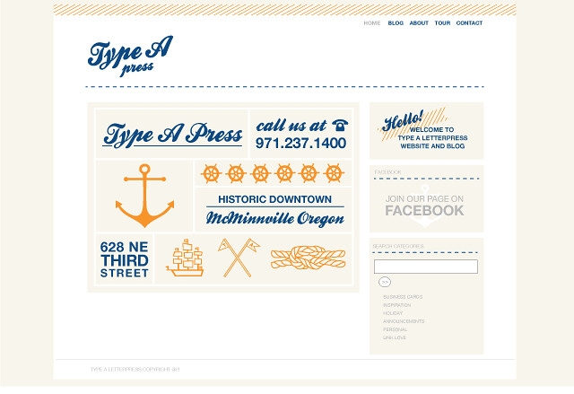
Welcome to today’s 2 cent Tuesday. I realize for most of you it is already Wednesday... but it is Tuesday here and I am still in full swing! Today's topic: How much should I charge and how do I explain my prices to my clients?

officeina_jar
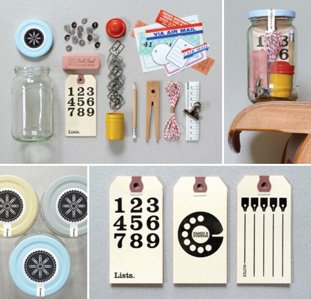
Office in a Jar by Present and Correct

HOW MUCH SHOULD I CHARGE?

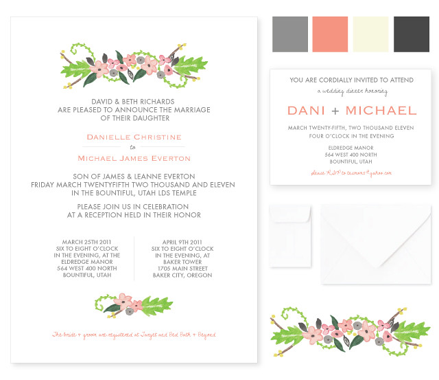
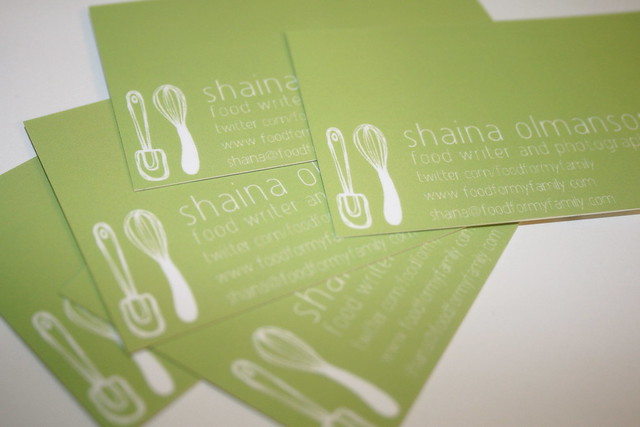
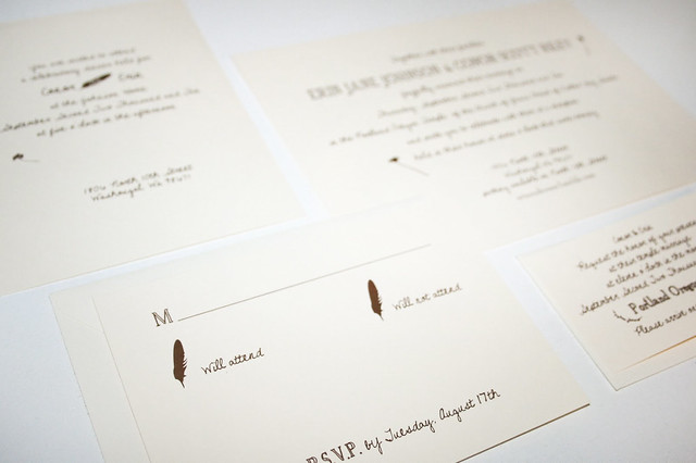
First of all, let’s start at the start. All freelance graphic designers charged little to nothing when they first got started. This directly reflected where they were as a designer – at the bottom. The first real job I took on while still in college was designing a wedding invitation. I designed, printed and assembled every invitation myself. Then I hand carved a linoleum stamp and personally inked and printed every individual enclosure. For hours upon hours upon hours of tedious work I charged $50. And when I was done I felt guilty asking for the check. HAHA! That makes me laugh today. But, I, like everyone else out there had to start somewhere.

Luckily for me the couple that I designed the invitations for were very grateful, so fun to work with and completely supportive of my creative ability. Also luckily for me not everyone I worked with after that was. I say luckily because this is how I learned to charge what I am worth. After that first great experience I kept charging almost nothing but I started to notice that some clients weren't always fun to work with. They started to ask for a million and one revisions. They wanted to see something just because they were curious about how it would look, not because they really wanted to use it. I actually had a client ask me to teach them how to do something so they could do it themselves (this last one really fried me). It got to the point where I felt abused and taken advantage of. I started to really hate what I was doing. When you undercharge for your services, and fail to communicate your expectations up front people WILL take advantage of you. Whether they mean to or not. And when you feel like you are being taken advantage of you start to resent your client, your work and then your life. So let go of your insecurities and the mindset that you aren't that good yet and start charging what you are worth.

My strategy for determining how much I should charge for my services is simple. I take into consideration two things. Number one – what is the average going rate for someone out there doing the work I am doing? And number two - what is my time worth to me? When I say “my time” I mean time with my husband, time taking care of myself, time with my soon to be new baby boy, etc. What is the price I need to be paid in order to feel good about giving up “my time?" Every time someone presents me with a project I ask myself these two questions. How Design has a great breakdown of Graphic Designer’s Hourly Rates. If after looking at that you are still unsure (or you are in another field of freelance) I strongly suggest you do some research into what the average going rate for some one like you should be. As far as how much your time is worth - well, that is not something you can Google. But trust me, at some point you have got to come up with a price that makes giving up “your time” worth it or you will be terribly unhappy when your client deviates from the project’s original path (and they will 90% of the time).

So, take a good look at your skills, remind yourself that your clients are coming to you because they cannot do this work themselves and you are worth every penny you are about to charge them. Then you should probably go ahead and add 10% to your price just for good measure. I know a lot of you are still undercharging. Of course we all have to start somewhere to gain experience but when you start to think that your client is a pain in your side you maybe just need to re-evaluate what you are charging and how you are communicating the terms of your services. It might be you, not them, with the problem. 99.9% of the time that I have done my part communicating my value and my expectations up front I have worked with amazing clients. Which brings us right to our next question.

HOW DO I EXPLAIN MY PRICES TO MY CLIENTS AND BILL THEM ACCORDINGLY?

invoice

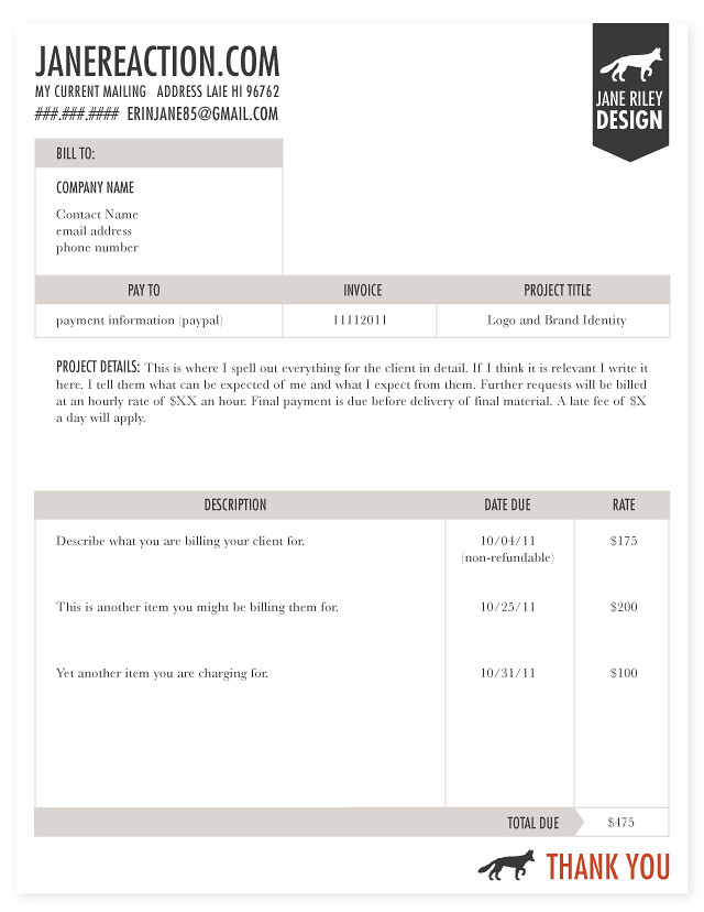
You give them an invoice outlining everything in detail! After discussing the details of a project with a client I determine the total cost and write up an invoice. In my invoice I am very specific about the project timeline, the amount of revisions the client will be allotted, when they are expected to pay me, how they should pay and what they will be charged if they request any additional revisions. I also let them know what I will charge for every day that their payment is late. I go ahead and let the client know right away that I expect half up front before I even touch their project. I outline all of these things for every single project. No matter what. And because things seem to fall through the cracks sometimes I don't just stop there. I reiterate everything in an email. Later, when things start to deviate from the original course I refer my client back to these two documents and let them know that I was not originally commissioned for the task they are requesting but that I would be happy to do it for the previously mentioned agreed upon price. When a project takes longer than it should I refer my client back to the invoice and remind them politely that we are on a schedule. This system has worked very well for me. The only time it has failed is when I have failed to provide them with an invoice at the very beginning.

Don't know what to include in your invoice? Check outSmashing Magazine, they have a great article with tips and examples on how to invoice like a pro. Don't know where to start when designing your invoice? Adobe offers free Illustrator templates that allow you to customize an invoice for your business. My invoice is loosely based off of this design - it is clean, easy to read and looks professional. If you do not currently send and invoice at the beginning of every project start now. Send one for every project - big or small. It doesn't matter if the client is your 5-year-old niece requesting you design her birthday invitation, you should get in the habit of sending an invoice every time. I guess that last example was a little extreme but writing and sending and invoice every time will save you tears and frustration many times over.

September 28, 2011

Kitchen Corners

kc1kc3
The lovely Damaris Palmer from Kitchen Corners recently revamped her food/design/lifestyle blog. I loved designing this logo for her. Food and design? What could be better? My two favorite things in the whole world. She had the talented Ana from Live and Enliven design her blog and the amazing underwater cooking session was shot by none other than Mark Lee.

July 29, 2011

Je Promets

jepromets_janereaction

I have been meaning to blog about this for sometime and just haven't gotten around to it. I'm proud to say that the website I was putting together for some lovely sisters has been up and running for a few months now. Kendra and Krista contacted me with the idea of starting a wedding blog that focuses on modern style and high fashion. They had a really good idea of the direction they wanted to go in, so it was a dream to put this together for them. Along with customizing their wordpress blog, I also created their brand identity and collateral. Check out their site here to get some wedding inspiration.

jepromets_website

Also, check out some of the other new projects I have up in my design portfolio. Ever since I got into my second trimester I feel like I have more energy than I know what to do with! It has been great. Hope everyone has a great weekend!

March 8, 2011

Lately

eleanor_roosevelt
My friends Nate and Katie have this quote hanging on their fridge. I love it. I had to sketch this to hang in our house. I think about it a lot. I think about this quote any time I hear people speaking badly of others. I think about it when I hear myself speaking badly of others. I think about it when my feelings get hurt by gossip that somehow found it's way back to me. I think about it even more when a friend gets their feelings hurt by gossip or even direct (misinformed) accusations. I think about it when I am in a group of people and I want to seem interesting or cool. I think it is a good quote to keep up in your old noggin.

***So many people asked! We just had to put this in our shop. This quote will be available in 5 x 7 and in two different colors. Come and get 'em!

February 7, 2011

Wedding Invitation: Dani Richards

dani
Had fun putting together some wedding invitations for Dani and Michael a few weeks ago. These are not the exact ones that they chose but I had a lot of fun hand painting the flowers for this set so I had to share. Congratulations you two! Best wishes to you!

January 30, 2011

Breathe

breathe
As many of you know I am now working with photographer Natalie Norton. While I don't want this blog to turn into the Natalie Norton show I do believe I will occasionally be sharing some of the things we are working on together. Two reasons: 1. to share more of my design work on this blog and 2. because I am excited about the things we are creating. I am really excited to be attending the Breathe workshop in Las Vegas this February. It is providing a lot of design opportunities within Natalie's photography business not to mention the workshop itself is going to be a great experience! It was originally a workshop for women with strong family values that wanted to thrive in their photography careers, however, it is applicable to all women who are striving to maintain balance between marriage/family and their small businesses (read graphic designers). To learn more about this great opportunity for women entrepreneurs click here.
And yes, all of the illustrations on Natalie's blog lately are my handy work. I am loving this new job!

January 14, 2011

Exciting News!

for_natalie
I got the job! Whoo whoo!! After several months of holding out for the perfect job (for me) I finally found it. I have been looking for something close to home, an outlet for my creativity and graphic design skills, and something that inspires and challenges me. I found all three, and it just so happens that I will now be working for one of my favorite photographers! I will be doing a lot of different things but I am really excited to apply my graphic design degree and get more business savvy. Can't wait to get started!

December 30, 2010

FREE January Calendar and Giveaway!

january_calendar_chiefandcrown
There is a new calendar in our etsy shop for the year 2011. To celebrate the new year I am giving away the month of January for free to anyone who would like it. Simply click here to open the file and print it out for you and a friend! I am also giving away a printable (PDF) version of all twelve months to three people. To enter this giveaway leave a comment below. I hope everyone has a great New Years celebration tomorrow evening! Winners will be announced on January 3rd.IMG_2284IMG_2285

November 26, 2010

Professional Photo Editing

I am now offering photo editing to my list of services. If you are a photographer in need of a photo editor or you just have a great photograph that needs a few touch ups please let me know. I would be happy to make them perfect for you! Here are a few examples of some retouched photos. The left side is the original photograph and the right is after editing. katemarenrunnerconor
Do you have any photos you need edited? Contact me for more information.

November 23, 2010

Business Cards

IMG_1463
Professionally printed and designed business cards starting at $70.00. Contact me for more information. Leave a comment with a link to where you have blogged, tweeted, or posted this offer and receive $15 off. Offer ends Dec. 10th.

November 10, 2010

Food For My Family Business Cards

IMG_1435IMG_1440ffmf_bcardIMG_1434IMG_1438Just finished up a fun project working with this talented lady. Shaina Olmanson is a great photographer and writer. One of her main projects Food For My Family, focuses on cooking with your children and for your family. Enjoy her beautiful photography and expertise advice from the kitchen!

August 25, 2010

The Announcement

Designing wedding announcements is a blast, until you have to design your own... and then it is terrifying. I put way too much pressure on myself and then finally I just had to go with one idea. I was inspired by all of the flowers that Grandma Wilde (Conor's grandma) had embroidered on to all of our napkins. And of course Conor LOVES feathers so we had to tie that in some how. I think they turned out alright. IMG_0246IMG_0232