

No. 1 LEARN THE BASICS (image source)
Before you can really appreciate great typography and layout you need to understand what makes great typography great. Become familiar with certain type styles: serif, sans serif, script, hand drawn, etc. If you would really like to read up on the subject visit I love Typography and read Paul Dean’s eXtreme Type Terminology column. It is loaded with great information about typography, the history behind type faces and type setting.
 No. 2 ESTABLISH A HIERARCHY AND A GRID (image source)
Hierarchy refers to where you want the reader to start reading and how they should proceed. Your header or title does not always need to be located at the upper left hand corner. With a well-defined hierarchy the reader’s eyes will be drawn to the most important information first. Using size and type faces to establish a hierarchy is important. It is also important to stick to a grid. When doing this don’t let the length of your paragraph line be so long that the paragraphs become difficult to read. On the other hand don’t let line length be so short that the eye can’t stay focused.
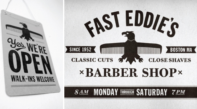 No. 3 DON'T OVERWHELM YOUR DESIGN WITH TOO MANY FONTS (image source)
A good rule of thumb is to use around 3 to 4 fonts. Keeping your fonts consistent throughout your layout will help you establish your hierarchy and provide balance. Ever wonder what font is being used in a certain layout? Fonts In Use is a great site to look at to get some typography ideas AND it tells you what font is being used where.
 No. 4 AVOID USING DECORATIVE FONTS IN YOUR BODY COPY (image source)
Decorative type faces should be used as accents or headers in your design. Script type, hand drawn type, overly complicated type - should not be used in a paragraph! Ever. When laying out a web site or an editorial piece information is key. Allow your reader to actually read it.
 No. 5 PAIR FONTS TOGETHER WISELY (image source)
Thoughtfully pair serif, sans serif and scripted type faces together. Using different fonts to compliment each other is an art. It also gives your design more depth and interest. Avoid pairing two fonts that are very similar to each other, this will just look like a sloppy mistake.
Need an excellent source for downloading free fonts besides dafont.com? Try LostType.com, they have some very beautiful fonts that you can download for free.
4 comments:
erin i've loved your design posts...they have been so helpful for dummies like me!
i learn so much from these posts! love them!
THANK YOU FOR THIS!
I really love your 2 cents series. Thank you for all the inspiration. come out baby!
Post a Comment