So I decided mid-summer I would officially take my maternity leave starting November 2. I thought planning this out in advance would be best so that I wasn't tempted to work right up until my due date just in case baby came early. Well, baby didn't come early and a quickie project presented itself to me this last week and I just had to take it! Time moves so slow when waiting for a little one to arrive and I needed a project to distract me from thinking about how many more minutes might have to pass before I can hold my little boy in my arms. I can't think of any other situation on earth that can make a grown woman look at her calendar 10 million times a day only to think that if she just looks at it one more time something might have changed. Bla bla bla, enough about babies, right? Anyway, back to the point - I took on a quick logo project which I am going to share with you now and explain a little bit about my design process.
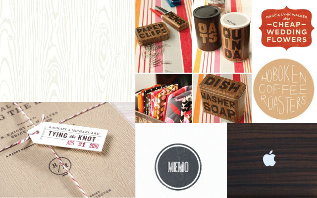
This client contacted me about designing a logo for her and her husband's construction company. After talking things over on the phone I usually ask clients to make an inspiration board or pin things on Pinterest to give me an idea of what they are looking for. I was genuinely nervous to see what some one would pin for a construction company logo - I thought it might be stiff and boring. I was pleasantly surprised when I got a peek at her board and saw the above images (sorry there are no photo credits - I just literally dragged them off of her pin board). I could have kissed her! She also mentioned that her and her husband really like the idea of an "S" for Solo Corp made into the shape of a house to symbolize construction.
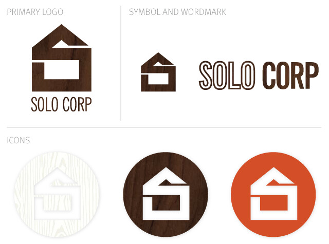
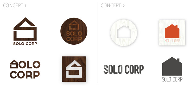
I presented her with two concepts based on her verbal direction and visual inspiration. Of course there was more than what is shown above - this is just a sneak peek. She ended up liking a combination of the two. It has been my experience that everyone does this, and I usually encourage it. I know that I am not going to nail exactly what they are looking for in one concept so I usually let clients know it is ok to tell me what they like and what they don't like. Together we can eliminate what is wrong and fill in what is missing. After going over the concepts together this is what we came up with:  I am actually super excited about how it turned out - I really didn't think I would love creating a logo for a construction company but I really did. Now, I just need to take my own advice from my last "Two Cent Tuesday" and take it to the next level "just because I want to". Can you imagine what fun things could be created from this design? Business cards, letterheads, t-shirts for the crew... etc?! I will definitely have to share some of my projects that I have been working on "just because I want to" at a later time. But for now ladies and gentlemen I am off to enjoy a baby shower!! YAAAAY!
 I am actually super excited about how it turned out - I really didn't think I would love creating a logo for a construction company but I really did. Now, I just need to take my own advice from my last "Two Cent Tuesday" and take it to the next level "just because I want to". Can you imagine what fun things could be created from this design? Business cards, letterheads, t-shirts for the crew... etc?! I will definitely have to share some of my projects that I have been working on "just because I want to" at a later time. But for now ladies and gentlemen I am off to enjoy a baby shower!! YAAAAY!

2 comments:
Love the icons! I love how it uses texture, nice job!
I love when you share things like this! So interesting.
Post a Comment