
I’ve never really considered myself a blogger. I think I am a graphic designer who has a little blog on the side. However, I think I have been around the blogging block enough times to give some advice on beautifying your blog. This advice is for anyone starting a blog, whether it’s about photography, design, or just a personal journal. These are some simple things you can do yourself to improve the look and feel of your blog before seeking out professional help.
 #1. FIND A UNIQUE, CLEAN, EASY TO NAVIGATE TEMPLATE ONLINE
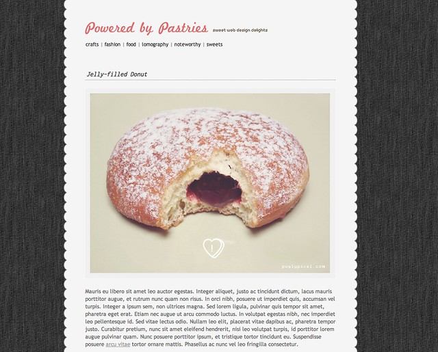
The first thing I notice when looking at a new blog is the layout. Blogs that look clean and easy to navigate are always going to be more appealing. Blogs that look like the generic blogger template that everyone else has or have been freakishly overloaded with graphics, colors and buttons are going to lose me fast. You can find some pretty sweet blog layouts on the internet for free. One really great source out there is Pugly Pixel (responsible for layout featured in photo above). If you don’t know about this site already you seriously have to check this girl out – she has tons of cool downloads and tutorials for fancying up your blog, half of which are free!! Find something out there that is as close to what you want your blog to look like and then customize it.
 #2. CUSTOMIZE YOUR BLOG TO FIT YOUR NEEDS AND STYLE
In order to customize your layout you might need to do a little digging into the CSS and HTML behind your template. Does this intimidate you? Don’t let it. There are thousands of tutorials and step by step instructions out there on how to adjust certain elements of your blog. You just have to be willing to search for them. When I started blogging on a regular basis I realized that most of the blogs that drew me in had wider pictures that were consistently the same width. I asked around about how these bloggers were able to do this and then I Googled it. Between the helpful advice and the online tutorials I was able to come up with my current solution: I upload all photos and images through Flickr by copying and pasting the share code into my posts. This allows me to archive all of my blog’s content while presenting wide, clear photos that are consistently 640 pixels wide. Look at the blogs you love to read and ask yourself what some of the common visual elements are. For web design inspiration I often go to Siteinspire.com. This site has a massive library of beautifully designed blogs and websites of every kind.
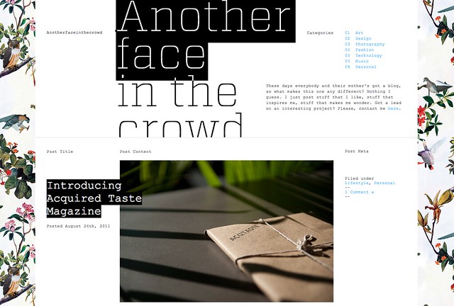
Blog featured above: Another Face in the Crowd found via Siteinspire.com.
 #3. ADHERE TO SOME SIMPLE DESIGN GUIDELINES WHEN CUSTOMIZING YOUR BLOG.
The following are just guidelines not hard and fast rules that can’t be broken. And remember that in the design world rules are made to be broken - you just need to know them in order to know why you are breaking them.
No. 1 – Keep your blog a manageable width. Your overall width should be somewhere between 900 and 1200 pixels. Blogs that are too wide often become very difficult to fill with clean, neatly laid out content. Blogs that are too narrow will limit your ability to present large beautiful photos.
No. 2 – Your blog should stick to a strict 2 or 3 column setup. Most blogs use a 2-column setup with the main column taking up 2/3rds of the space and the sidebar taking up the remaining 1/3rd. The rule of thirds can be your best friend.
No. 3 – If your photos are vertically oriented - pair them together in order to fill your entire content width. Nothing allows your eyes to focus more clearly on content than nice straight clean lines up and down the page.
No. 4 – Left align your text and allow it to fill your content bar. Unless you are writing poetry or a grocery list your blog should probably read like a book or a newspaper column. The human eye will thank you for doing it this favor.
#3. ADHERE TO SOME SIMPLE DESIGN GUIDELINES WHEN CUSTOMIZING YOUR BLOG.The following are just guidelines not hard and fast rules that can’t be broken. And remember that in the design world rules are made to be broken - you just need to know them in order to know why you are breaking them.
No. 1 – Keep your blog a manageable width. Your overall width should be somewhere between 900 and 1200 pixels. Blogs that are too wide often become very difficult to fill with clean, neatly laid out content. Blogs that are too narrow will limit your ability to present large beautiful photos.
No. 2 – Your blog should stick to a strict 2 or 3 column setup. Most blogs use a 2-column setup with the main column taking up 2/3rds of the space and the sidebar taking up the remaining 1/3rd. The rule of thirds can be your best friend.
No. 3 – If your photos are vertically oriented - pair them together in order to fill your entire content width. Nothing allows your eyes to focus more clearly on content than nice straight clean lines up and down the page.
No. 4 – Left align your text and allow it to fill your content bar. Unless you are writing poetry or a grocery list your blog should probably read like a book or a newspaper column. The human eye will thank you for doing it this favor.
No. 5 - Only blog your best work/photos/ideas. People will know when you are just filling your blog with meaningless content and they will lose interest fast. Contrary to popular belief it is OK to take a break from blogging every once in a while to ensure quality content. Just make sure your readers know you will be back with more of what they want to see.
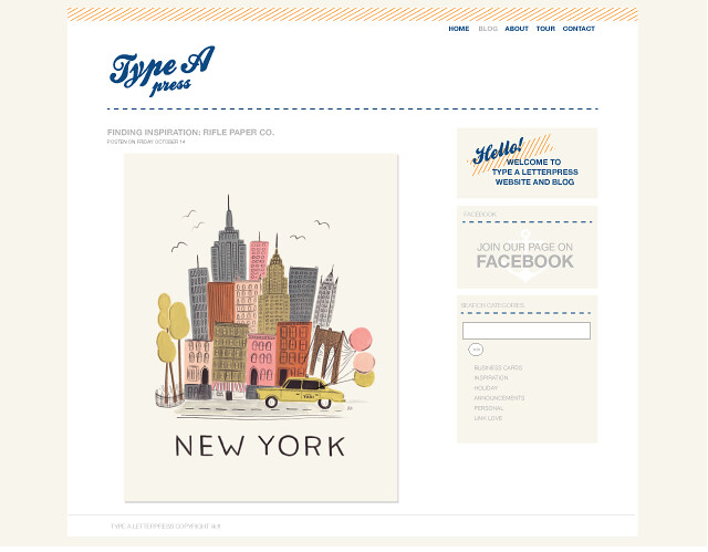
Above blog designed by me for Type A Press.
5 comments:
I seriously love your blog...how awesome are you to share information like this? I still want to pay you to make sure that the look is refined, and you are giving me the tools to keep it going myself. Great strategy!
Yes. Love this post. I absolutely need to give my blog a bit of an overhaul, but I felt good knowing I was doing at least one thing right (keep photos a consistent size! ha!).
A question about No. 4 - "left align your text". For the life of me, I can figure out how to get the text to totally line up flush with my photos. The text is always just a bit more to the left. I've googled tutorials etc. and haven't been able to figure it out....
Any thoughts?
Thanks again for sharing this.
xo.
Chelsey - thanks! you are so great!
Janis - I just emailed you a mini "how-to" to fix your problem! haha I'm such a nerd!!
I always appreciate the tips that established bloggers give; these are really great tips. I've been making some edits recently and few things you have mentioned made me think about what I am doing on my own blog. Thank you for sharing!
Can;t figure out how to get my photos to all be the same size and work with flickr... but this inspired me to! Thank you!!
Post a Comment